QR Code Design Ideas: 24 Looks That Still Scan
24 QR code design ideas for the code, the frame around it, and the place it lives. Each one comes with a scan-risk rating, so you know which ideas are safe and which need a test first.
A QR code is the one piece of design that gets marked by a machine before a person ever sees it. That changes how you design one. You can be playful. You just have to stay readable while you do it.
Below are 24 QR code design ideas in three groups: styling the code itself, framing it, and placing it in the world. Each one has a scan-risk rating. None means it only changes words. Low means it rarely causes trouble. Medium means it works but deserves its own test. Nothing here is rated High. Those ideas have their own section at the end.
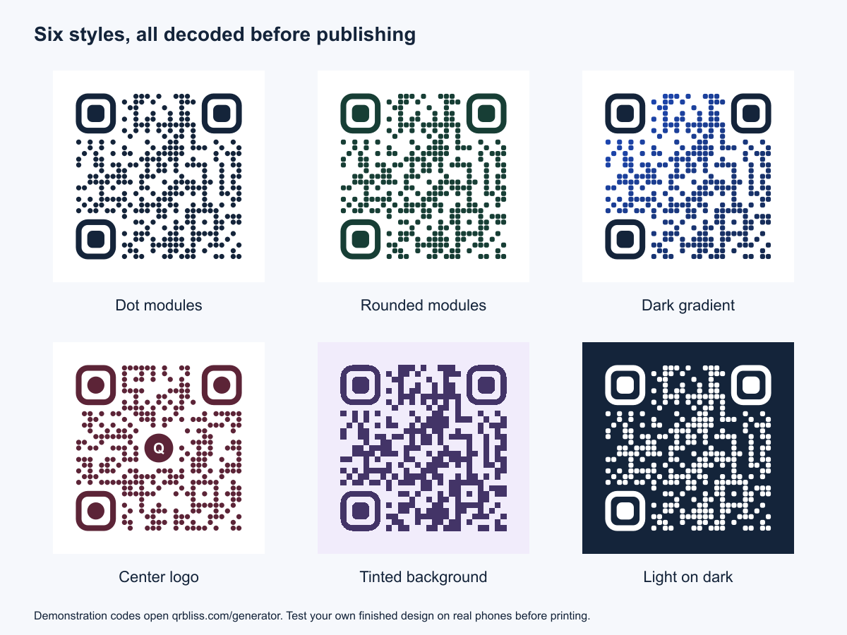
Every code in this post was decoded with the zxing-cpp scanning library before publishing. They open the QRBliss generator. That proves the files decode on a screen. It does not prove your printed version will, so test yours.
Style the code itself
These ideas change the pattern: its shapes, colors, and center. Start here. A code that looks good on its own needs less help from the layout around it.
1. Dot modules
Swap the small squares for circles. It is the fastest way to make a code look designed rather than generic. It is also where the QRBliss editor starts.
Scan risk: Low. Dots keep the same grid and the same contrast. One limit: animated exports need square or rounded modules (see idea 18).
2. Rounded modules
Rounded squares sit between the classic look and dots. They feel softer than squares and more structured than circles. Good for brands that use rounded type or rounded buttons.
Scan risk: Low.
3. Rounded or dot eyes
The three large corner squares are called eyes (or finder patterns). Phones use them to find the code and work out which way up it is. You can still style them. The editor offers Square, Rounded, and Dot eye styles.
Scan risk: Low, as long as each eye is still a ring around a solid center. Don't remove them or break them into pieces.
4. Eyes in an accent color
Give the eyes their own color while the rest of the code stays dark. A navy code with deep red eyes looks deliberate, and it costs nothing in readability if both colors are dark.
Scan risk: Low to Medium. The eyes need strong contrast too. The QRBliss scan test flags eyes below 3:1 against the background.
5. A dark two-color gradient
Run the code from one dark color to another: cobalt to navy, plum to black, forest to near-black. In the editor the gradient is linear, with four directions (horizontal, vertical, and two diagonals), and it applies to the modules while the eyes stay solid.
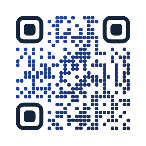
Scan risk: Low, if both ends are dark. A gradient that fades toward white turns part of the code into a low-contrast code. That part is where the scan fails.
6. Your brand palette, pulled from your logo
Upload a logo and AI Brand Sync extracts its colors in your browser and applies them to the foreground, eyes, and background. If the extracted colors are too close together to scan, it adjusts them and tells you it did.
Scan risk: Low. The contrast check runs as part of the process.
7. A tinted background
Replace pure white with a very pale tint of your brand color: lavender behind purple, pale mint behind green. It looks more finished on a colored page than a stark white square.
Scan risk: Low to Medium. Keep the tint pale. If you would describe the background as "a color" rather than "off-white", it is probably too strong.
8. Light on dark
White modules on a navy or black background. It looks great on dark packaging and dark slides.
Scan risk: Medium. Inverted codes work on many phones and fail on some older Android cameras. Use it where you know your audience's devices, or where a failed scan isn't costly.
9. A transparent background
Export the code with no background so it sits directly on your artwork. The transparent QR code page covers when that helps.
Scan risk: Medium. A transparent file has no contrast of its own. It borrows whatever is behind it. Check it on the final background, not on the white of your design app.
10. A logo in the center
The most requested design idea, and a reliable one if you keep it modest. In the logo QR generator the logo size runs from 16% to 40% of the code, and the editor warns you above 32%. The modules behind the logo are cleared so the two don't fight.
Scan risk: Low to Medium. Error correction lets a scanner recover damaged parts of a code, but that budget is shared with real-world wear: scuffs, glare, and ink spread. A smaller logo leaves more of it spare.
11. A platform icon instead of a logo
No logo file? Use the icon of the place the code opens. The Social and Business templates add the matching icon for you: Instagram, WhatsApp, Spotify, YouTube, a PDF, an App Store link. The icon tells people what they'll get before they scan.
Scan risk: Low.
12. Start from a template
If you'd rather edit than build, QRBliss has 36 templates in five groups: Artistic, Social, Business, Industry, and Minimal. Pick one close to your brand, then change the colors. It's quicker than a blank canvas. Run the scan test again after you change them.
Scan risk: Low.
Frame it
A bare code asks people to scan without saying why. A frame gives the code a border, a caption, and a reason. These ideas work on the space around the code.
13. A frame with a caption
QRBliss has 15 frames, from a simple Banner to a Ticket, Stamp, Arch, or Polaroid. Each takes a caption of up to 36 characters, and the frame is part of the downloaded file.
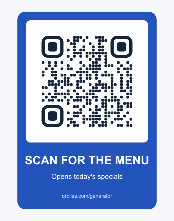
Scan risk: Low. If you build your own frame in a design app instead, keep it outside the code's clear margin.
14. Say what the scan opens
"Scan me" is the default caption on most QR codes. It's also the least useful. "Scan for the menu", "Scan to join the Wi-Fi", or "Scan for assembly video" tells people what they get. For more wording, see the QR call-to-action examples.
Scan risk: None. This one only changes the words.
15. A ticket or stamp frame for events
The Ticket and Stamp frames make a code look like admission, which is what it often is. Use them on invitations, event passes, and conference badges. The event QR code page covers what to link to.
Scan risk: Low.
16. A Polaroid frame for weddings and photo sharing
A Polaroid frame with "Share your photos" under it explains itself at a wedding table. See the wedding QR code ideas for where to put them.
Scan risk: Low.
17. A short web address under the code
Print a readable address below the code. It is a backup for anyone whose camera won't cooperate, and it tells people where they're going before they scan. Short beats complete: "yourcafe.com/menu" works better than a long tracking link.
Scan risk: None.
18. An animated code for screens
Codes on screens can move. The editor has four animations: Shimmer, Pulse, Gradient Flow, and Matrix Rain. They export as an animated GIF or WebP for digital signage, presentations, and social posts. You can preview them for free. Downloading an animated code is a Pro feature.
Scan risk: Medium. Animated exports need square or rounded modules, so switch away from dots first. And keep animation on screens. Paper doesn't move, no matter how hard the design brief wishes it would.
Place it
The same code can work well in one place and fail in another. These ideas are about where the code goes and how the layout around it helps.
19. A table tent with one action
One code, one job: the menu, the bill, or a review link. Don't stack three codes on one card. People scan the first one they see. See the menu QR code page for layouts.
Scan risk: Low.
20. The back of a business card
Put the code on the back, where it has room to breathe, and keep the front for your name. Link it to a contact card so one scan saves your details. The business card QR page has the setup.
Scan risk: Low to Medium. Business cards are small. Two centimeters square is the practical floor for a printed code, and a long link needs more room than a short one.
21. A flat panel on packaging
Pick the flattest panel on the box or bottle. Curves, folds, and seams distort the grid. For more examples, see QR codes on packaging.
Scan risk: Low on a flat panel, Medium on a curve.
22. A window sign with a solid backing
Codes on glass need a solid white backing panel behind them. Without one, the scanner sees the room behind the glass as part of the code.
Scan risk: Medium. Glare is the other problem. Test it at the time of day people will actually scan it.
23. A large code on a poster or wall
Big codes can carry bolder styling, because each module is large enough to survive it. Size the code to the distance: divide the scanning distance by ten. A code scanned from 5 meters needs to be about 50 cm across. The QR code size guide has the full table.
Scan risk: Low, at the right size.
24. A matching family of codes
When one campaign needs many codes (one per store, table, or product), give them all the same style, frame, and caption format. People learn the look and recognize it from across a room. Bulk generation keeps a large set consistent.
Scan risk: Low.
Ideas that look good and scan badly
Some designs look fine on a monitor and fail on paper. They are worth knowing, because each one comes up regularly.
1/ Pastel on white. Pale yellow, light grey, and baby pink look soft and modern. To a phone camera they are barely there. Keep the code dark.
2/ A gradient that fades out. The dark end scans. The pale end doesn't. The scanner needs the whole code.
3/ A fully circular code. Round dots are fine. Rounding off the corner eyes or cropping the code into a circle removes the patterns the camera uses to find it.
4/ A photo behind the code. A busy background adds dark and light patches the scanner reads as modules. Put the code on a solid panel.
5/ The logo that grew. A logo starts at a sensible size, then someone asks for it bigger, twice. The editor warns above 32% for a reason.
| Idea | Looks | Scans |
|---|---|---|
| Dot or rounded modules | Designed | Reliably |
| Dark gradient, solid eyes | Designed | Reliably |
| Pastel modules on white | Soft | Poorly |
| Gradient fading toward white | Soft | Partly |
| Circular crop | Different | Poorly |
| Code over a photo | Busy | Unpredictably |
Test before you print
Design ideas are only as good as the scan test at the end. Before you send anything to print:
- Run the QRBliss Scan test panel. It checks contrast against three device tiers and offers a one-click contrast boost if the code is too pale.
- Scan the exported file from a second screen with at least two different phones, ideally one older Android.
- Print a proof at the final size and scan it from the distance people will actually stand at.
- Check the destination opens the right page. A code that scans perfectly into a 404 is still a failure.
The QR printing guide covers minimum size, margins, CMYK, and bleed, and the QR code design guide covers the rules underneath all of this: contrast, the quiet zone, logo size, and error correction.
When you're ready, open the generator and try the dot modules first. It's the smallest change with the biggest difference.
Frequently asked questions
How can I make my QR code look more creative?
Can a QR code be any color?
Do QR code designs affect scanning?
Can I change a QR code's design after it is printed?
What is the difference between this post and the QR code design guide?
Create your first QR code.
Free tier. No signup required to start. Dynamic codes included.
Make a QR →